Right time, right place
15 min read
A set of dashboard that predicts where and when marine species are likely to be present.

Goal
Design a universal dashboard that is scalable and caters to all possible marine species.
Role
UI design,
Design system
Platform
Desktop app
Team & Timeline
4 UX designers
3 weeks
The project was divided into two products Deckhand and Right time, Right Place(RTRP). In this case study we focus on RTRP with its design and scalability.
Context
01
Right Time, Right Place uses ocean and fisheries data to represent distribution of fish species.

Screenshot of the Right Time, Right Place dashboard for Oysters
Problem framing
02
Solution
03
Dashboard
Index
04
Jump to section
Research questions
01
Which data fields are required to make the dashboard inclusive and universal for all species?
Are there any species specific design layout requirements?
What are the different user roles and their specific needs within the dashboard?
What is the best layout to reduce cognitive load on analytical dashboards?
Secondary research
02
Desk research
Precedent research

Screenshot of PeskAAS Dashboard

Screenshot of Global Fishing Watch Dashboard
Primary research
03
Design workshop

Users
4 stakeholders
Type
Internal user
Goal
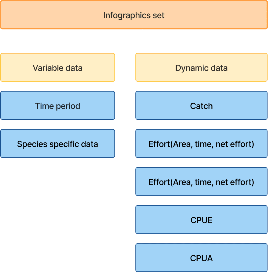
To develop an initial information architecture and identify the required category of information.
Outcome - Information architecture
Primary component
Secondary component
Data type
Action
Map actions



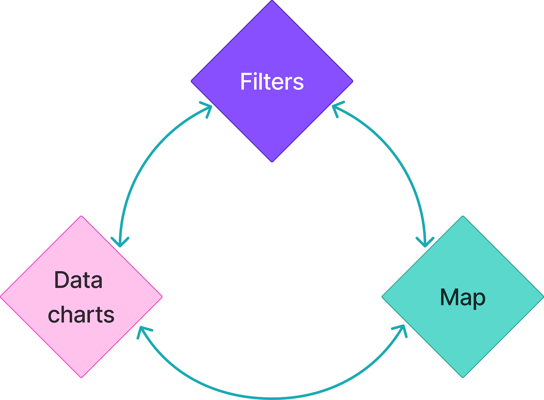
Flow of how the user would use the dashboard
The three main components for interactions where
The filters
The map
The data charts
Designing concepts
01
Concept development
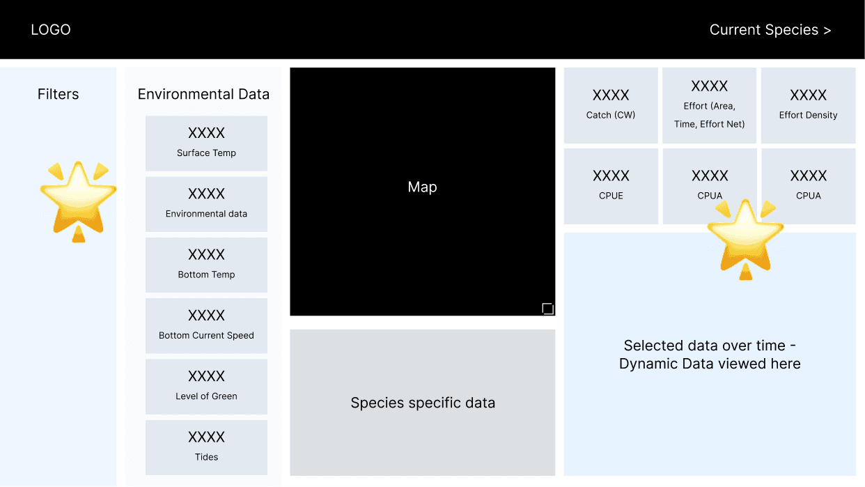
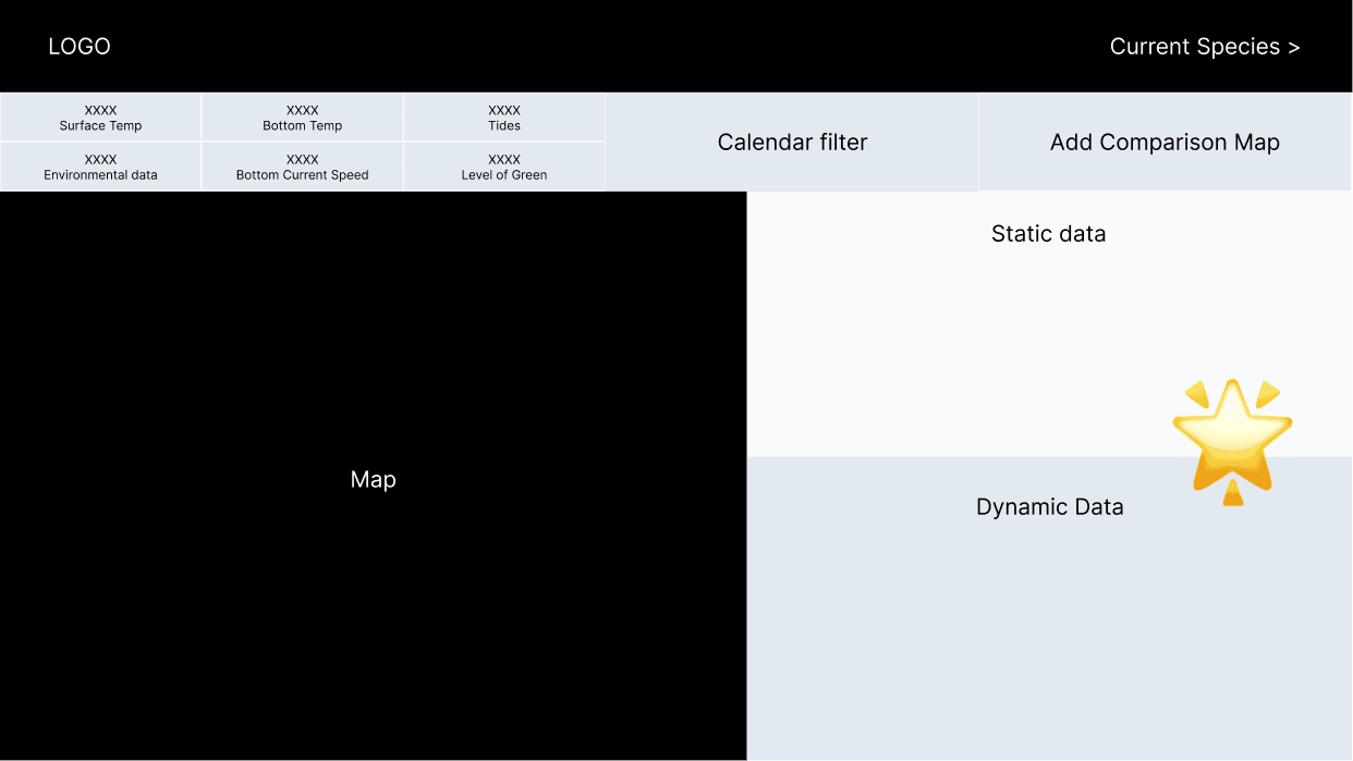
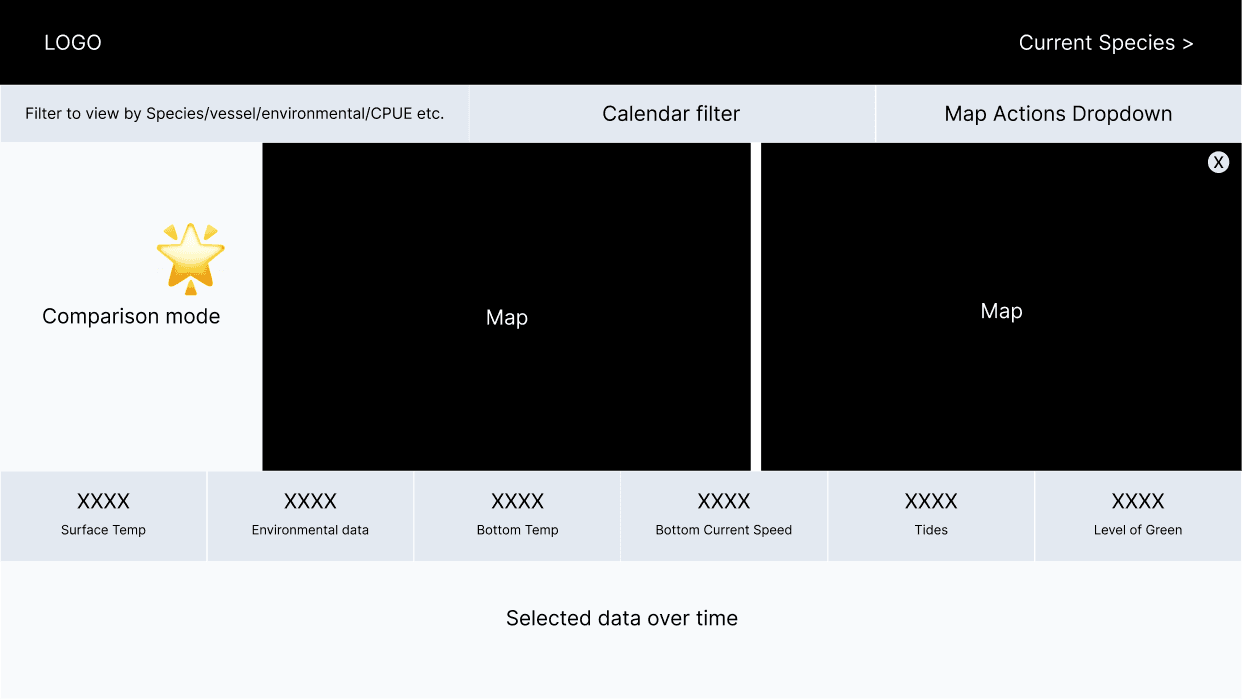
First stage
We explored layouts with different placements of the core components.

Research
01
Card sorting workshop
Users
3 stakeholders
Type
Data scientists
Goal
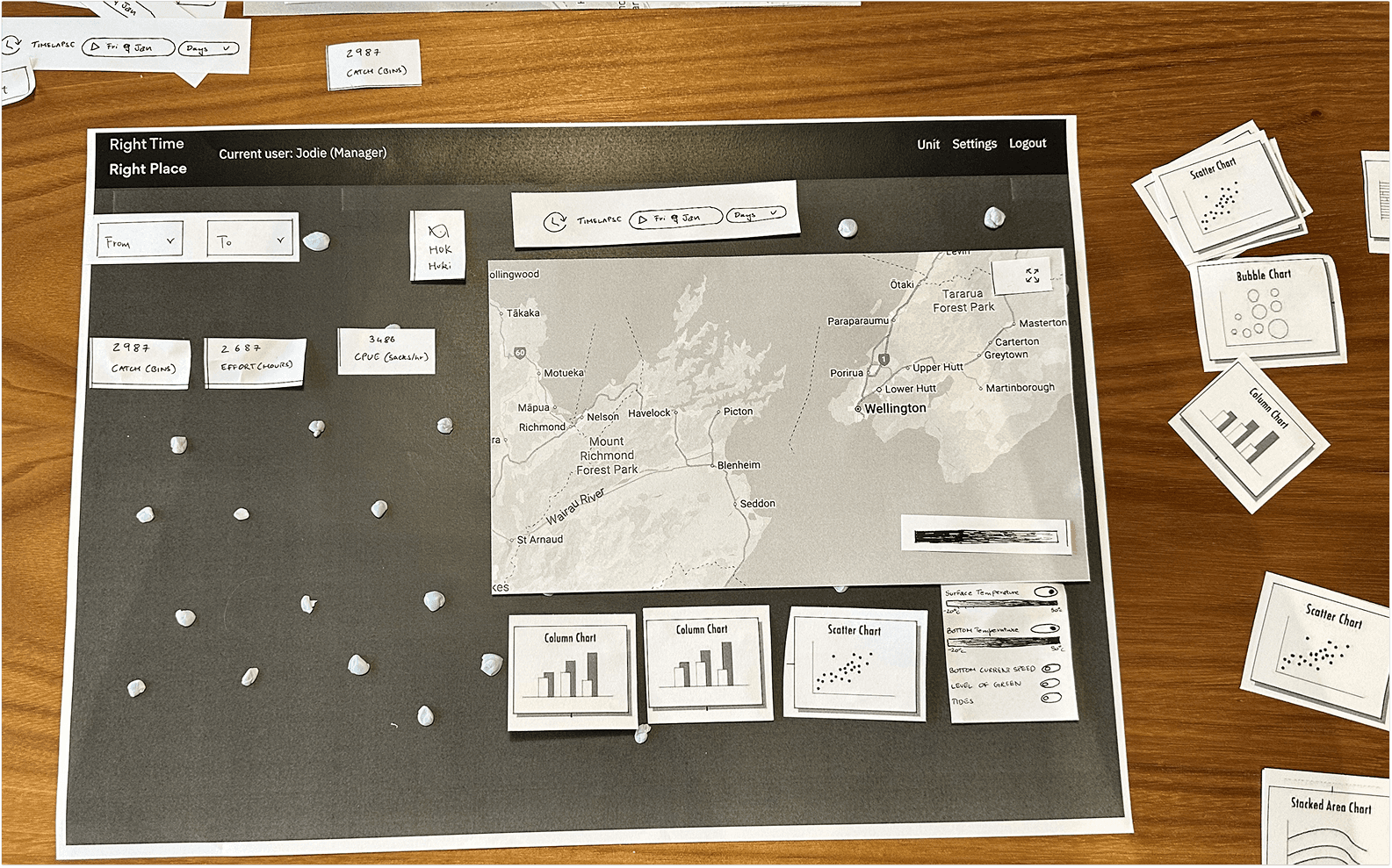
Understanding what data needs to be prioritised as well as testing different types of maps and data charts.
What we tried to understand

What we learnt
Designing concepts
01
Concept development


Proposed solution
02
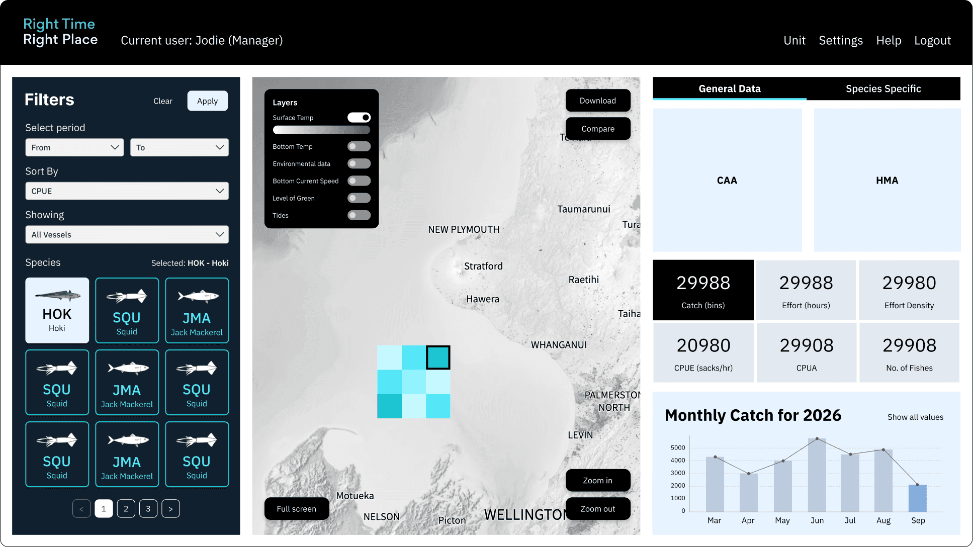
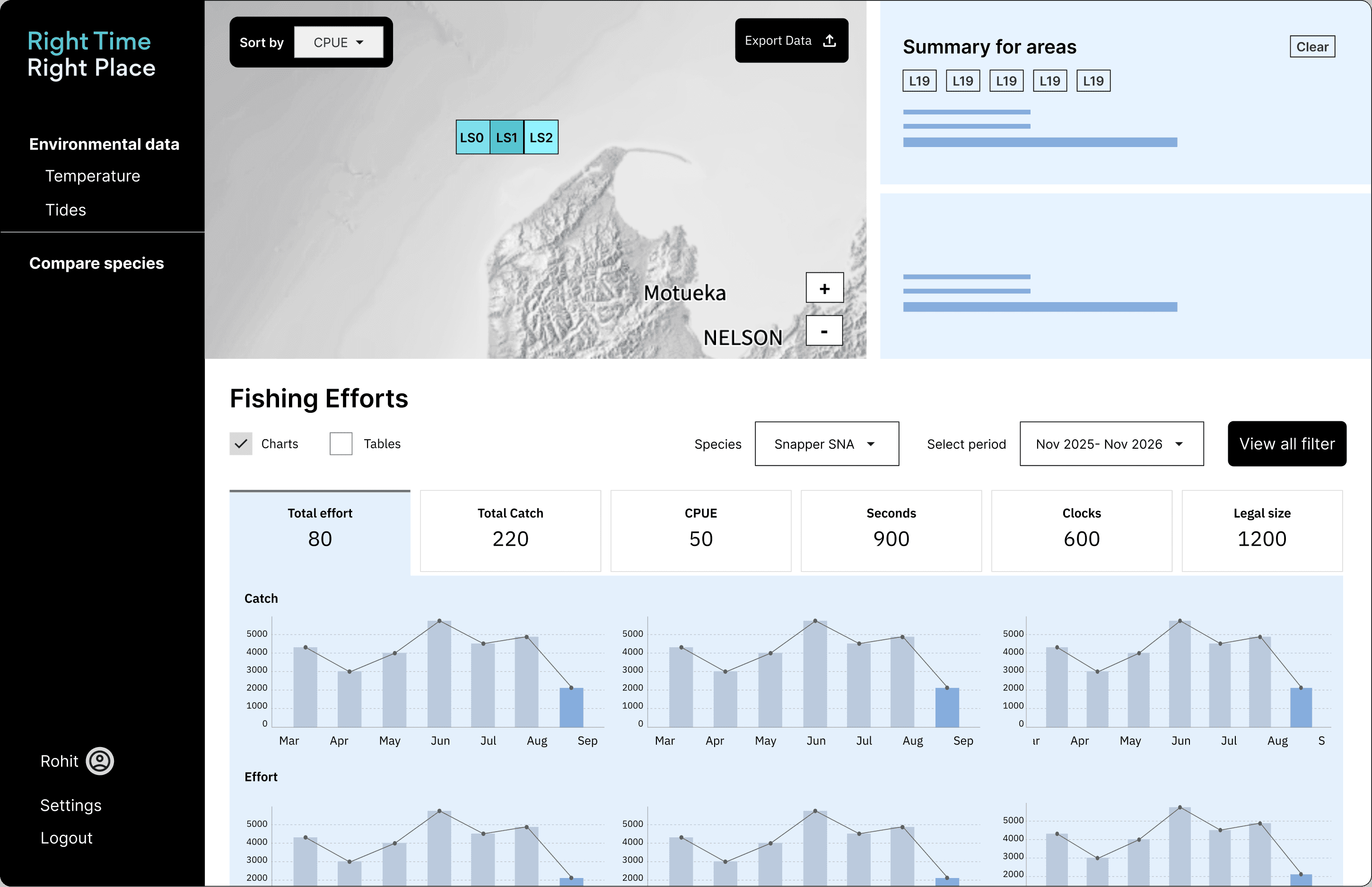
The following are the use-cases we know that the fisheries would take:
Colour guide

Dashboard
Before
After

Scalability of dashboard

The new search bar makes the dashboard highly scalable for any number of species, while introducing the ability to select multiple species at once.
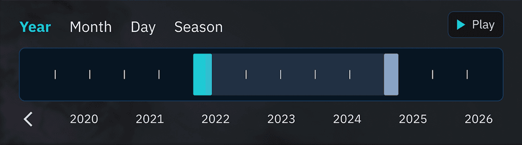
The timeline allows scientists to forecast data ranges and view those changes directly on the map through an animated time-lapse.

In case of too much data, the data summary component can be split into general data tab and a dedicated area for species specific details.
Learnings
03
Next steps
Limitations
Next Project
Deckhand
Electronic logbook for fishermen